

Showing posts with label typography. Show all posts
Showing posts with label typography. Show all posts
Friday, August 16, 2013
Theater Poster: Mark Twain's Mississippi

Monday, February 4, 2013
Society of Illustrators Juried Show

Honored to have this book cover I did selected for the Society of Illustrators Annual 55 (whoo-hoo!)
The opening reception was last Friday and runs until March 2nd 2013.
Unfortunately my work schedule means that I won't be able to check out the show in person, but if you do go, please drop me a line (and maybe a photo?)
Thursday, January 12, 2012
Portrait: Charlie Sheen
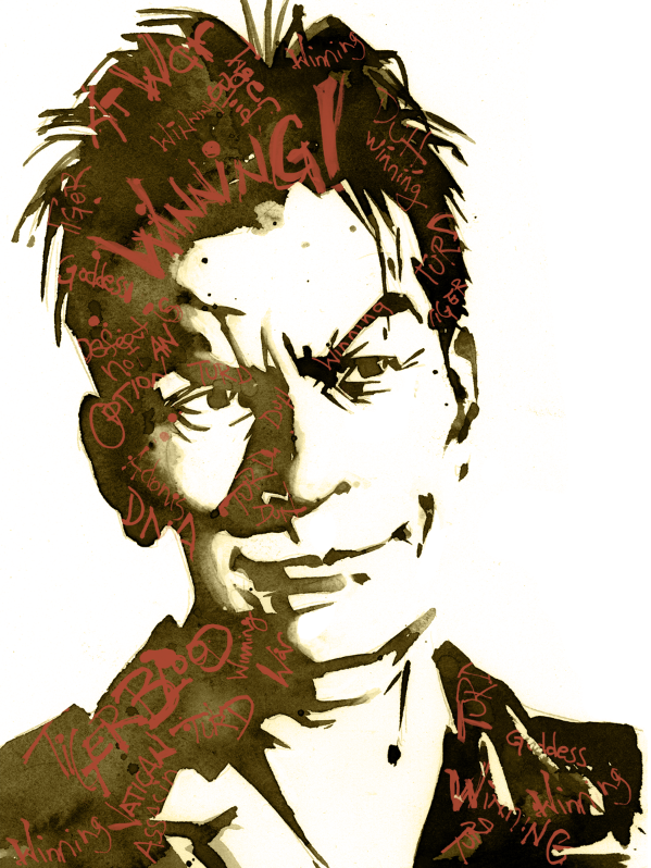
The idea is to choose a celebrity and after researching him or her assign keywords that will determine how the viewer responds to the finished art. Not one to ask my students to do something I wouldn't, here is my interpretation of Charlie Sheen (circa spring 2011). My keywords were: "Manaical, Self Involved, Dangerous"
Here is the process I used to arrive at the finished piece:

––––––––––––––––––––––––––––––––––––––––––––––––––––

Adjusted the photo so that it was more contrasty and the shapes that made up the features were clearer.
––––––––––––––––––––––––––––––––––––––––––––––––––––

The original photo did not have the feel/keywords I wanted so I modified his face to look more like the photos of Charlie Sheen when he was at his most volatile.
––––––––––––––––––––––––––––––––––––––––––––––––––––

Redrew the light and dark shapes so they could be transferred to watercolor paper
––––––––––––––––––––––––––––––––––––––––––––––––––––

––––––––––––––––––––––––––––––––––––––––––––––––––––

I wanted to add a second element that would further reinforce my keywords and decided on the "catchphrases" Charlie would endlessly spout during this period. Again, actively using a mark making style that would suggest a person coming unhinged.
––––––––––––––––––––––––––––––––––––––––––––––––––––
The two pieces were composited digitally and this is the end result.
––––––––––––––––––––––––––––––––––––––––––––––––––––

Wednesday, May 18, 2011
New Books: The Imagination Station Series
For the last year I have been working on a series of books "The Imagination Station" with Focus on the Family and Tyndale House Publishers. I've recently received my advance copies of the first two books in the series and wanted to show off the covers. Click the horizontal images for all the wraparound cover art goodness.


Monday, May 24, 2010

Wednesday, March 3, 2010
Recent Sketches: Font Faces

Tuesday, March 2, 2010
Recent Sketches

Watched the movie "Helvetica" last night. My doodles took on a decidedly typographic quality.
It is interesting that it's the counters to certain letterforms that I find the most distinctive. Not something I particularly noticed during my college type courses.
Friday, February 12, 2010

Friday, January 29, 2010
Fun with Type


As a change of pace. . . here's some sketches for a typography project I'm playing with. Ambigrams are fun! (For anyone who didn't catch "Angels and Demons" last summer the idea is that the word should read the same when it's turned 180˚. By the way the guy who did those ambigrams is 'freaking awesome. Check out John Langdon's work here )
Monday, November 30, 2009

Tuesday, December 2, 2008
Two Book out this Fall
Just in time for the holidays -- the last two books in the Dandilion Rhymes series:
God Loves Me More Than That

and "When God Created My Toes"

Both are available on Amazon or ordered at your local bookseller.
God Loves Me More Than That

and "When God Created My Toes"

Both are available on Amazon or ordered at your local bookseller.
Monday, June 4, 2007
New Books Coming This Fall 2007


These are the covers for the first two of a four book series I'm doing with Waterbrook Press an imprint of Random House Publishers. Look for these two to be published in October 2007.
Subscribe to:
Posts (Atom)

